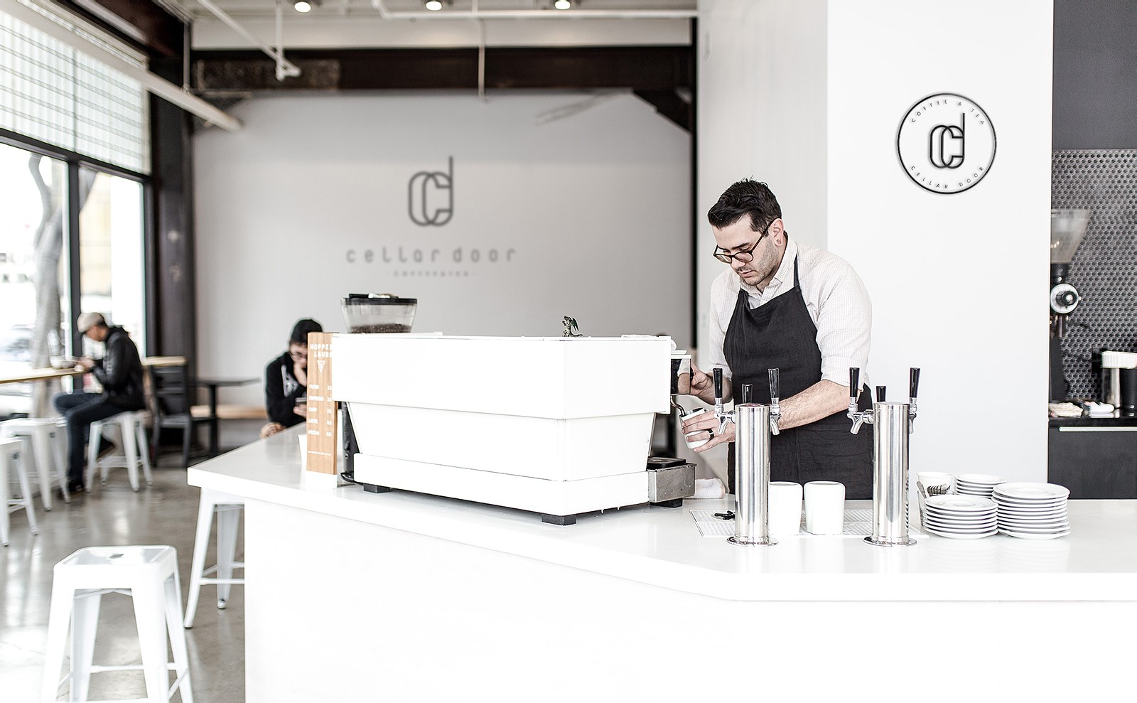
Cafe Cellar Door
Cafe CellarDoor 是一家位于多伦多市中心附近老街的咖啡馆。坐落在路口的一角,风格现代简约。委托方希望设计一款简约的logo,与名字的优雅相辅相成。
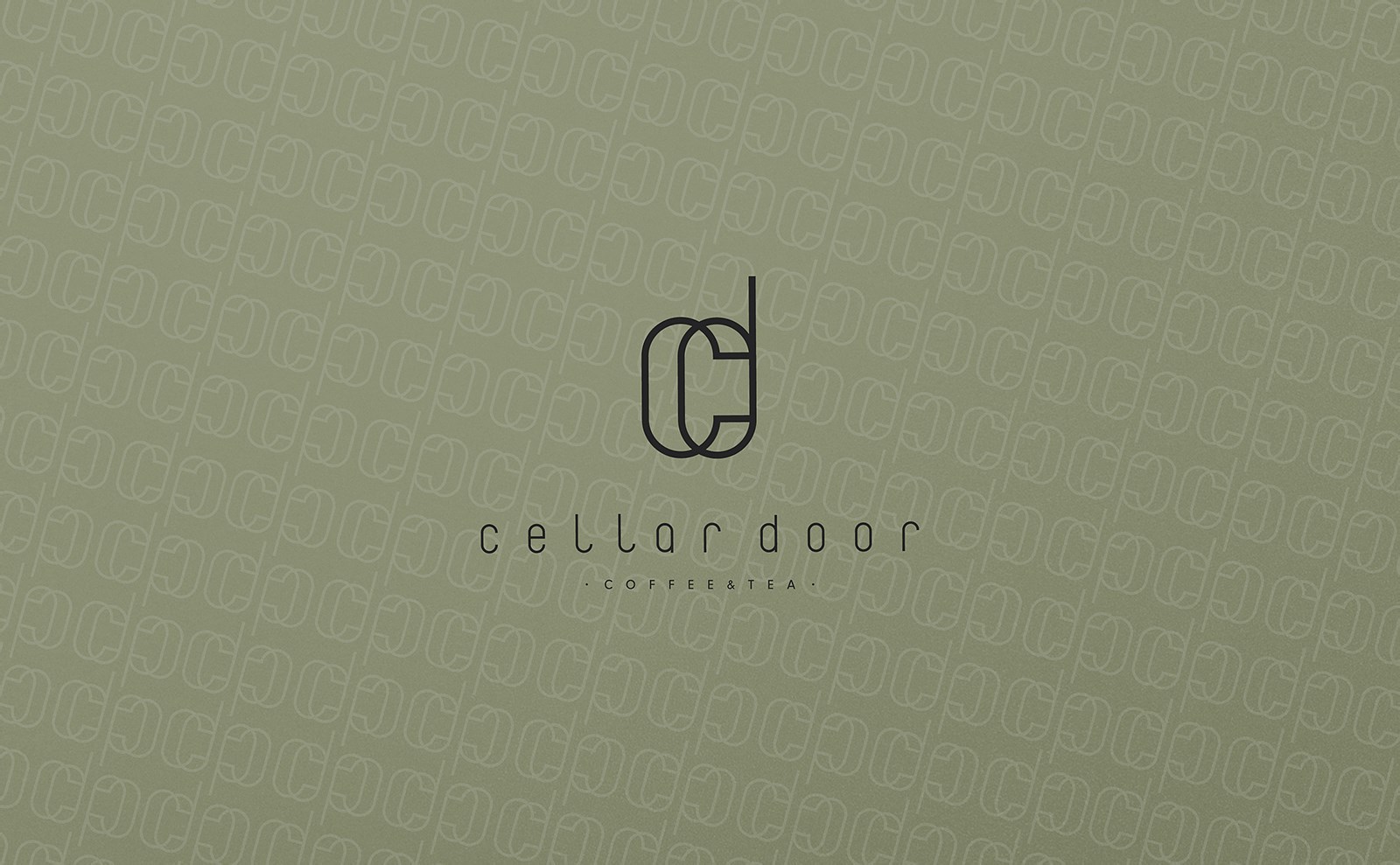
“In phonaesthetics, the English compound noun cellar door has been cited as an example of a word or phrase which is beautiful purely in terms of its sound (euphony), without regard for semantics (i.e., meaning).”摘自百科,CellarDoor被认为是英文中发音最美的词汇。
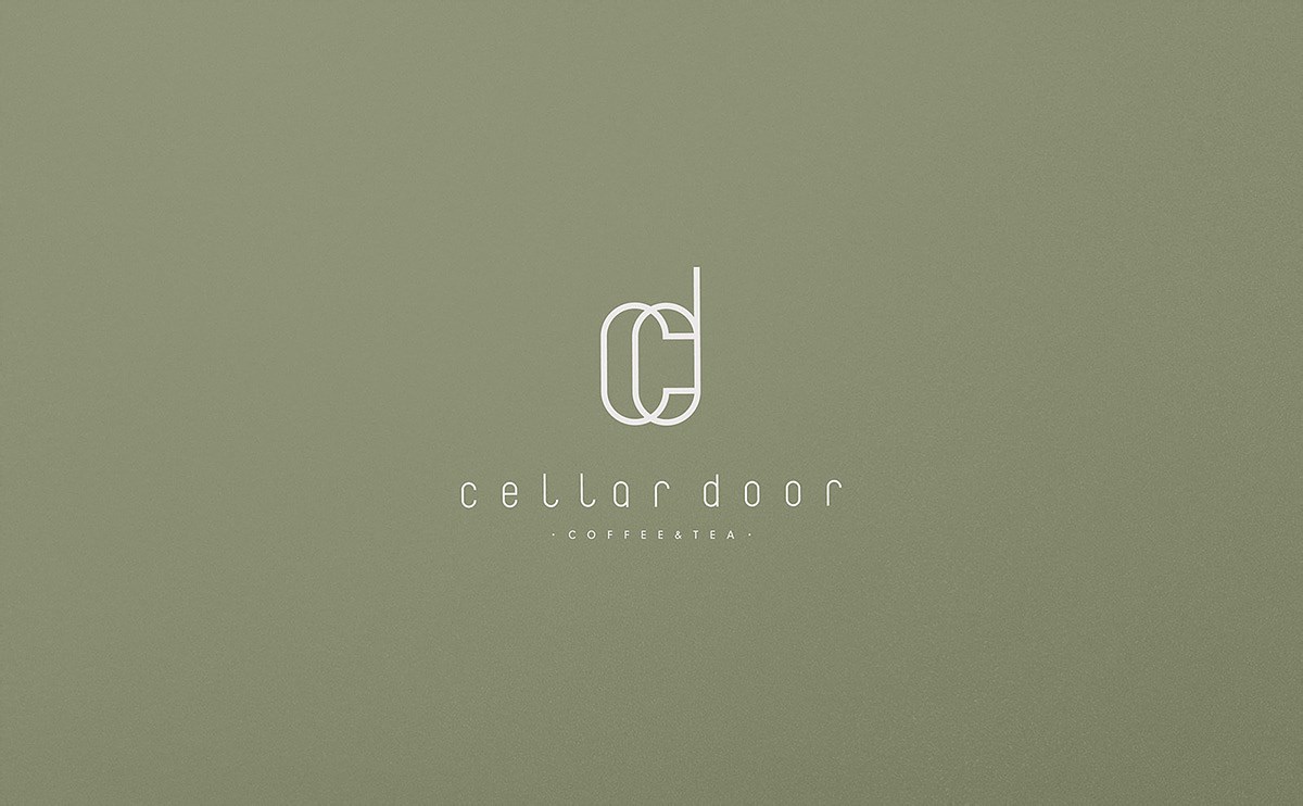
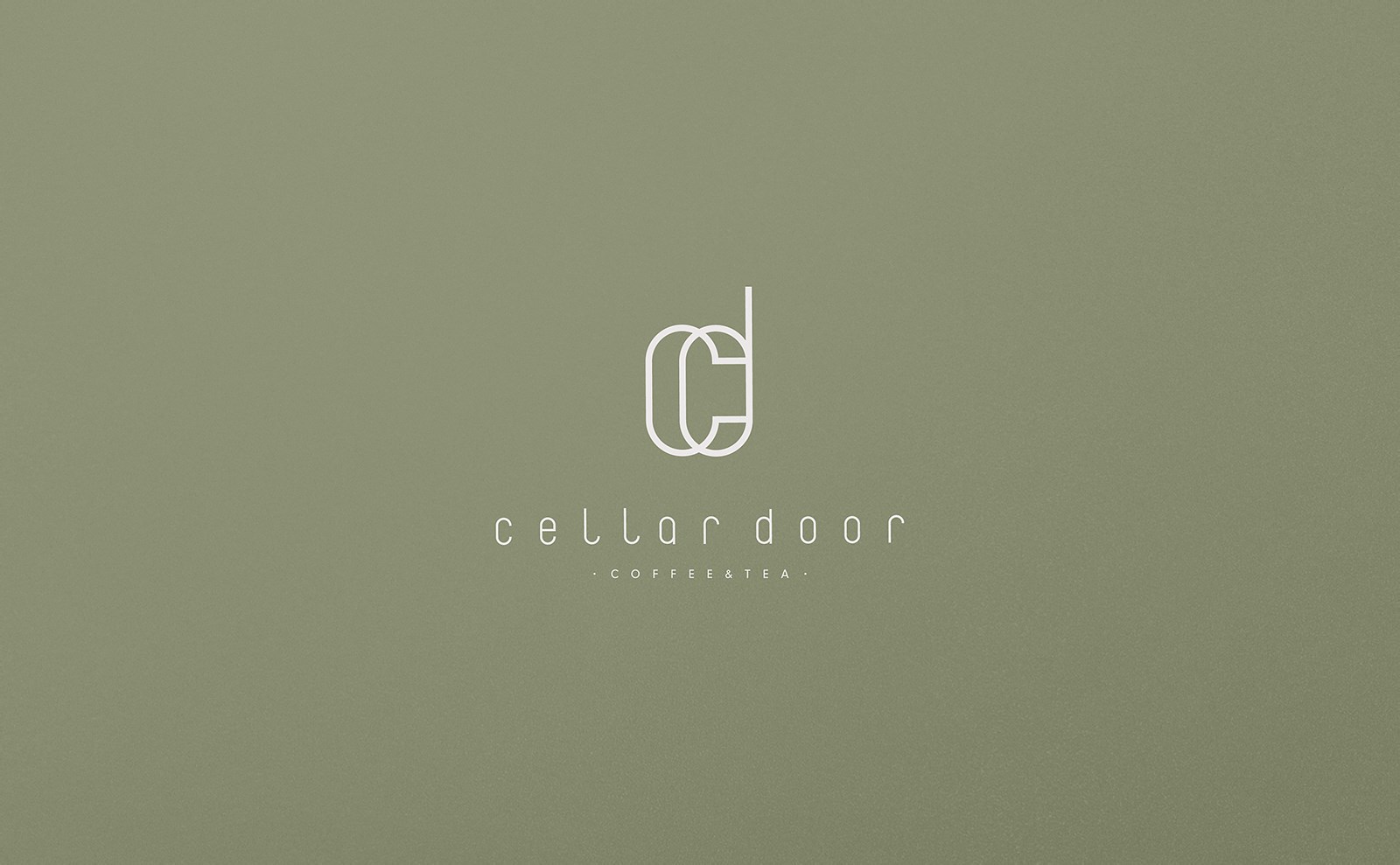
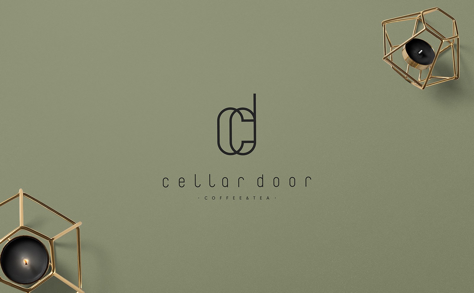
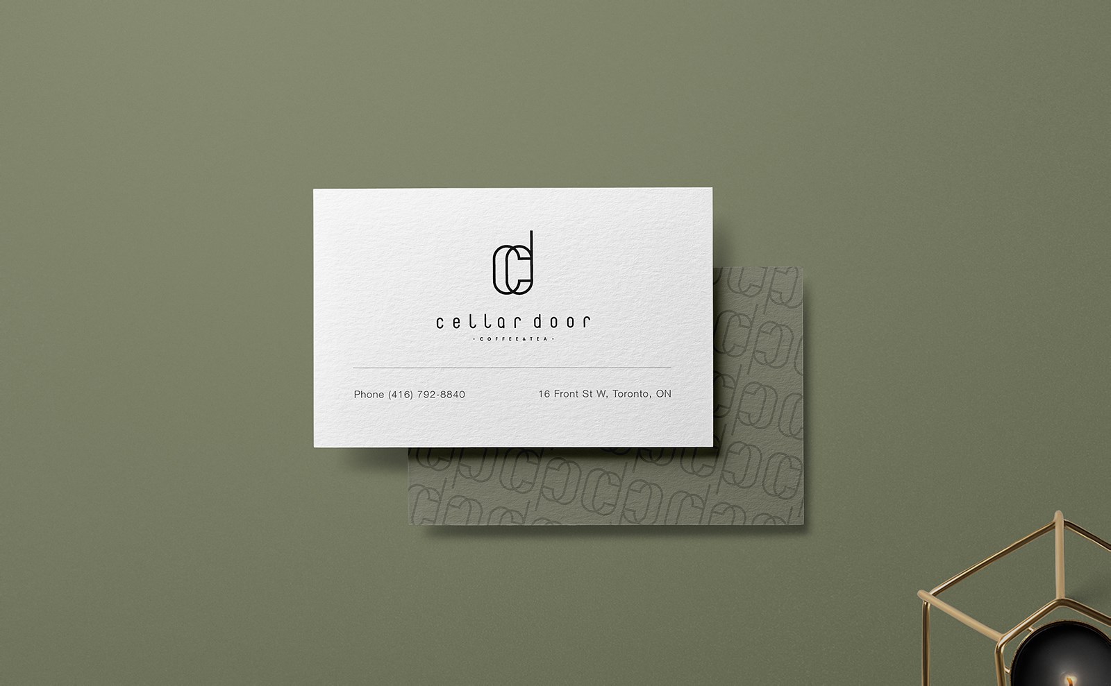
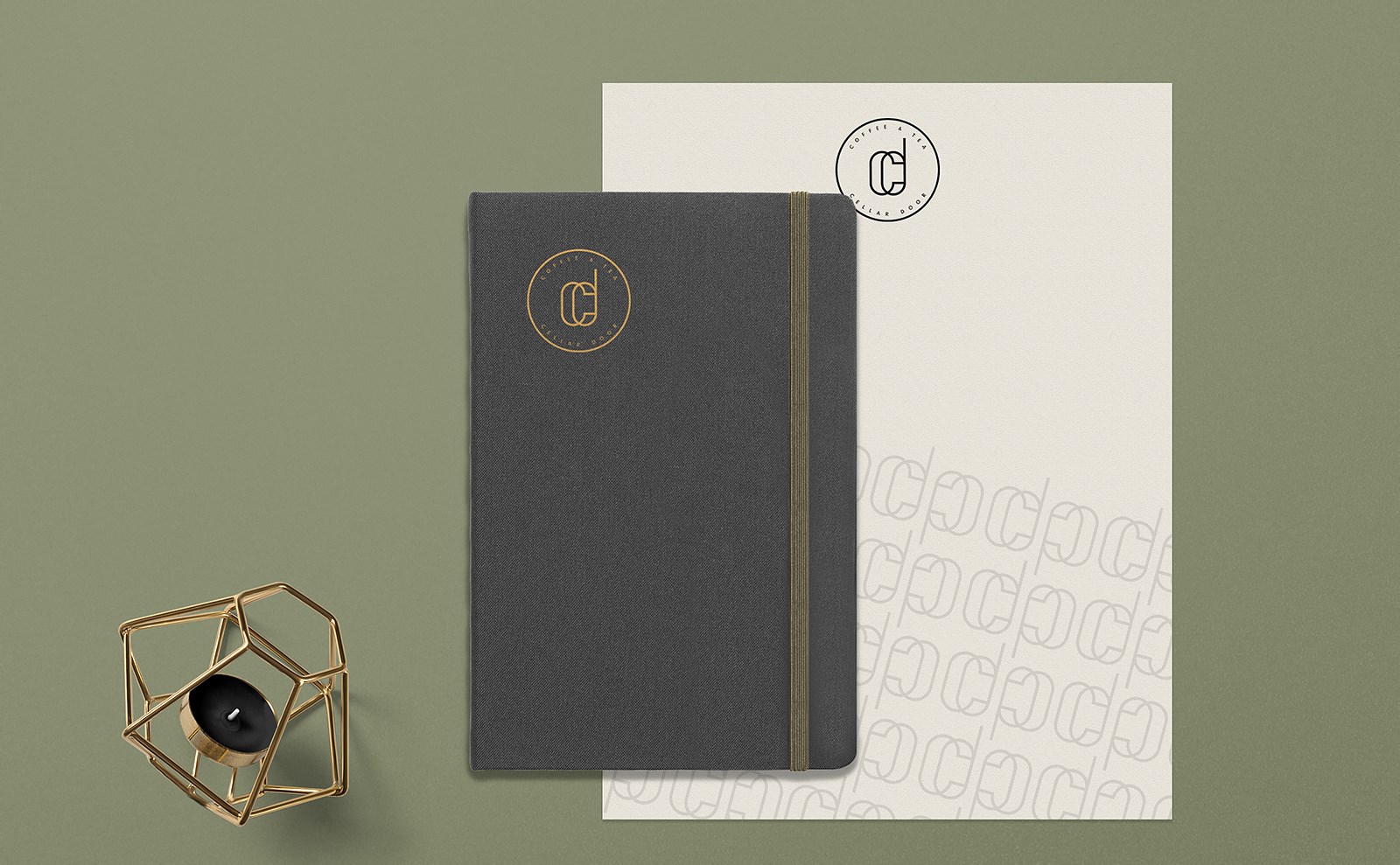
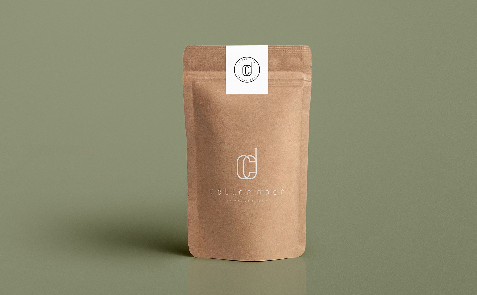
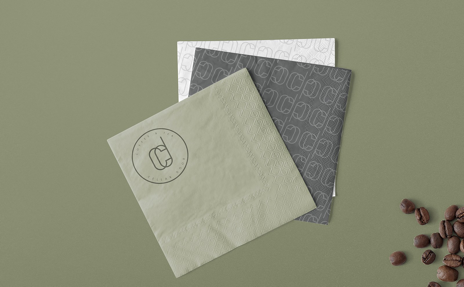
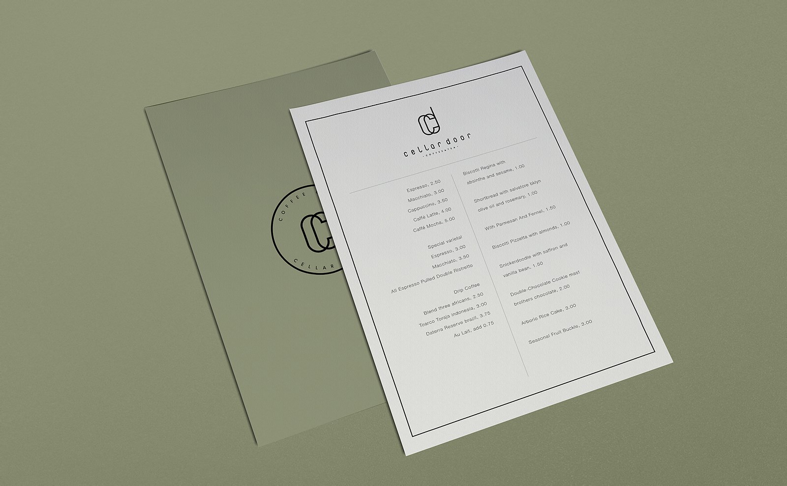
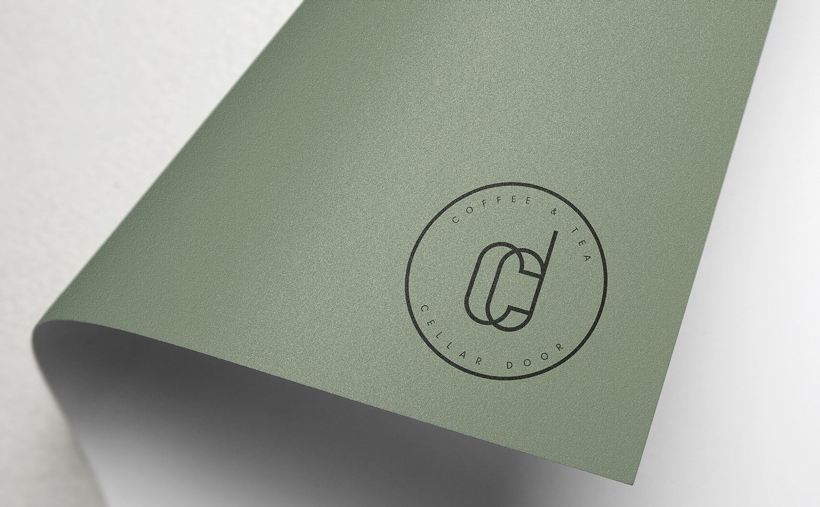
Logo整体在名称首字母的缩写作为设计基础,以线条的风格体现出字母之间的韵律与节奏,整体感觉极简、现代、高端。
品牌主色调采用淡橄榄绿为主,给人一种城市中的清雅,简单、淡雅、精致。


COPYRIGHT (©) 2024 Design Bakery Studio. 京ICP备16065108号-1 技术支持![]()
扫描二维码分享到微信